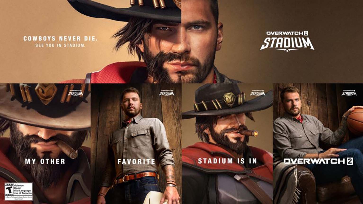
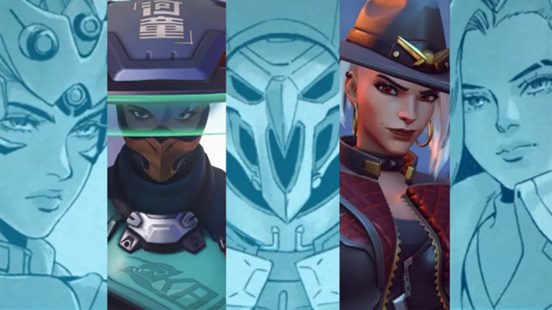
You see renewed debate around character design after Blizzard revealed new Overwatch heroes. Attention quickly centers on Anran, whose in-game face appears noticeably different from earlier teasers, prompting you to question how closely final designs reflect initial concepts.
You also notice broader concerns about visual identity across the roster. Many characters feel separated by hairstyles or markings rather than clear facial structure, which leads you to assess how easily you can recognize heroes at a glance.
Anran's features in Overwatch
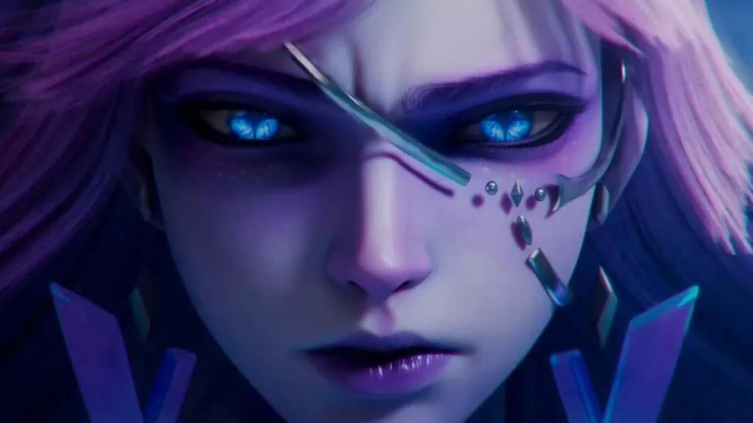
You notice Anran’s face follows Blizzard’s familiar visual style, with smooth proportions, simplified shapes, and expressive brows. That approach matches many recent heroes, which leads you to see fewer sharp or unconventional facial markers.
You may also observe that her final in-game model appears softer than early teasers suggested. Players often describe this shift as making her look younger and less severe, even though her role and abilities signal confidence and power.
Common points you will see discussed include:
- Rounded cheeks and a narrow jaw
- Large, cleanly defined eyes
- Minimal skin texture and subtle aging cues
| Element | Player perception |
|---|---|
| Facial structure | Similar to Kiriko and Juno |
| Expression range | Exaggerated but uniform |
| Overall identity | Clear outfit, less distinct face |
You encounter ongoing criticism that Blizzard creates striking weapons and costumes, yet struggles to give female heroes clearly differentiated faces.
Overwatch heroes visual identity
You see a consistent visual language that prioritizes clarity and cohesion. The game uses smooth textures, simplified facial features, and readable silhouettes so you can identify roles and abilities quickly, even at a distance.
This approach keeps every hero grounded in the same universe. It also limits how far designers can push facial variation without breaking that shared style, which can make some characters harder to tell apart in certain contexts.
You notice this most when cosmetic themes apply similar shapes and colors across multiple heroes. Some skins reduce distinctive cues, forcing you to rely on motion, posture, or effects instead of faces.
Key traits you encounter:
- Clean facial geometry with minimal surface detail
- Controlled proportions that favor readability
- Strong silhouettes over fine facial variation
| Design Goal | Player Impact |
|---|---|
| Visual cohesion | You recognize the world instantly |
| Stylized realism | You read characters quickly |
| Shared proportions | You sometimes confuse heroes |
Is this an Overwatch-only problem? No!
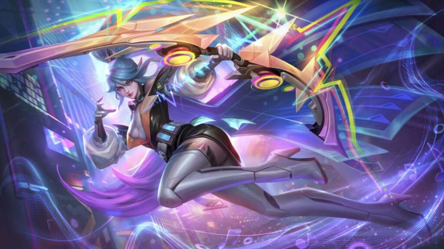
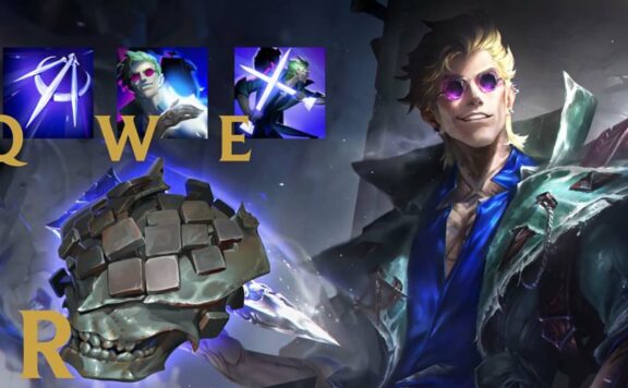
You see this pattern across many long-running games, not just Overwatch. Titles with large, evolving rosters often receive criticism when characters start to share facial structures, body types, or silhouettes. League of Legends frequently comes up in these discussions, despite having more than 170 playable champions.
You might expect such a massive roster to guarantee visual variety. In practice, you still notice recurring facial proportions and similar body designs, even after reworks and new releases. This consistency frustrates some players, but it also reflects deliberate design choices rather than oversight.
Studios that plan for years of updates usually protect a stable visual framework. That framework helps you instantly recognize which game a character belongs to, even outside gameplay. Over time, this visual familiarity becomes part of the brand itself.
Why developers keep this approach:
- Faster creation of new characters and skins
- Easier animation reuse without breaking existing systems
- Lower production costs across updates and events
- Smoother integration of cinematics and seasonal content
You also benefit from this stability in subtle ways. Shared proportions reduce animation bugs and make model updates safer when engines evolve. Developers can refresh lighting, textures, or rigs without rebuilding characters from scratch.
| Design Goal | Practical Effect |
|---|---|
| Visual consistency | Strong brand recognition |
| Shared frameworks | Quicker updates |
| Long-term planning | Fewer technical risks |
You may dislike seeing similarities persist, but studios prioritize longevity. They choose recognizable design systems over short-lived visual trends to keep their games cohesive and sustainable.